
Case study: Waitrose Retail Conference
BACKGROUND
The Communications Art Team I lead were asked to create the logo and branding for the Waitrose Retail Conference. Named Toast & Transform, it would celebrate Partners’ [staff] achievements and focus on future development, especially digital and technology roll-out.
The conference working group sent us a series of AI-generated graphics that they had created. None of these adhered to the Waitrose brand, but presented issues such as scalability and multi-channel (print and online) usability.
We were given less than two weeks (while working on other live projects) to progress from presenting initial ideas, to supplying vector and bitmapped artwork for conference centre screens, lanyards and table talkers, etc.
The project was further complicated by Waitrose relaunching its own customer-facing branding at the same time. Therefore we had to work within the confines of a brand that hadn’t been completed or shared.
VISION
Initially, we tried various lockups that embraced both the AI ideas and Waitrose branding from previous events. But it soon became clear that the working group lacked the design knowledge needed to understand our approach.
With time so limited, I produced a presentation that clearly articulated and demonstrated our reasoning. Treating this as a pitch to an internal client, I led the working group through our brand adherence, and the limitations of their supplied ideas, with visuals that demonstated my opinions.
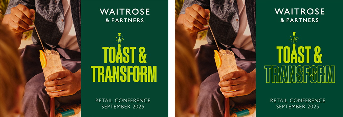
This landed well and gave me the freedom to create a series of typographic lockups that simplified their initial ideas, while feeling more fun and considered.
The main logo needed to scale from very large digital display screens down to small sizing on branded stationery. So a simple, vector design was a non-negotiable. I wanted the design to work as a standalone graphic, and when paired with a photo, to follow one of Waitrose’s main design styles.
OUTCOME
• A successful supply of all required assets against very tight deadlines
• A cost-neutral creative project, saving Waitrose from commissioning an external agency
• Successfully integrated the new Waitrose brand, so that any signage seen by the public would be correct – avoiding reputational concerns
FINAL DESIGN
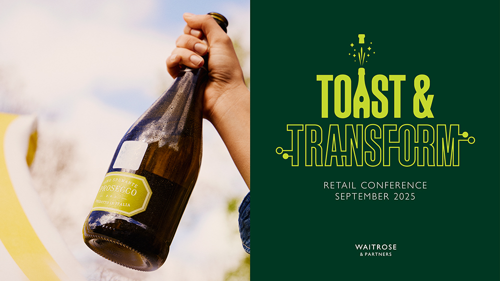
• The final Waitrose Retail Conference Toast & Transform logo lockup
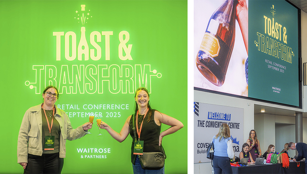
• The Toast & Transform logo in use at the conference
WORK IN PROGRESS
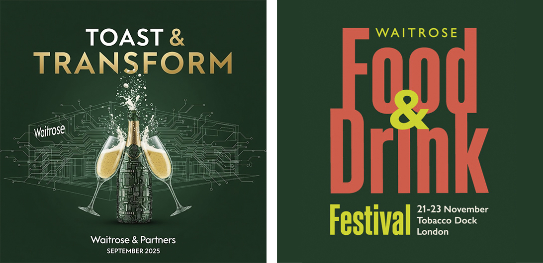
• The supplied AI-created logo design and a previous Waitrose event logo
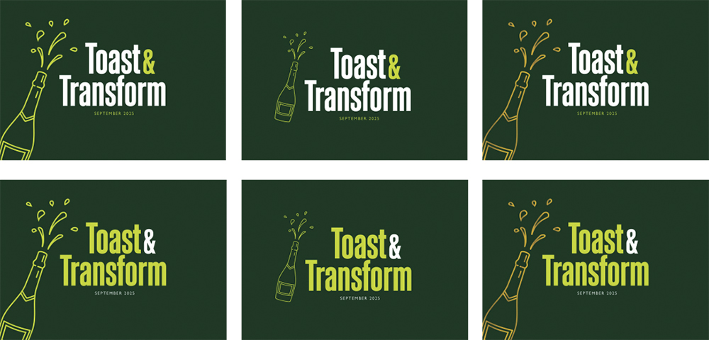
• Some of the initial logo ideas created
• Two of the developed logo ideas