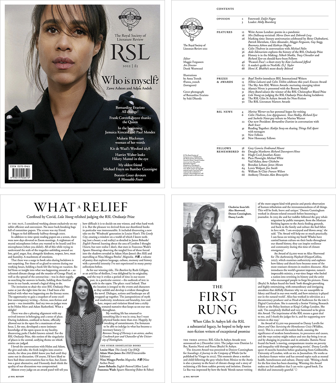
Case study: RSL Review redesign
BACKGROUND
The Royal Society of Literature (RSL) approached me to take over an urgent redesign of their internal magazine, the Review.
Unhappy with a commissioned redesign, and with only a few weeks to launch to their Fellows (members), I was challenged to art direct and produce my vision for this prestigious literary magazine.
Historically, the Review had been more of a traditional newsletter. Produced in-house, it was extremely text-heavy, monochrome, and had little regard for aesthetics, navigation, image use, or brand.
The Review had previously relied on a bank of author headshots, with one or two event photos. This felt very repetitive and uninspiring, with photos often low resolution and unoptimised.
A recent brand refresh had been completed, but I discovered it had been solely focused on online – there were no guidelines for print use. This meant I also had to adapt and interpret the supplied guidelines while working live, in order to hit the scheduled print deadline.
RSL proposed that, from my redesign onwards, each issue would feature their commissioned annual ‘Illustrator-in-Residence’ – providing a cover and internal illustration that would need art directing.
VISION
I envisaged the Review as an elegant, coffee-table magazine that would encourage Fellows to keep each issue for reference.
I knew I was going to have to rework the magazine from the ground up – creating new templates and grids, using new typography, and creating a proper type hierarchy.
I was given free rein to interpret the different editorials (themed around Britain, Freedom, Gatherings, Judgement, Legends, Living Archives and Translations) as I saw fit. Some of the topics were quite philosophical or linguistic in nature, so I immersed myself in wider reading on authors and discourse, so that I felt I was doing justice to the commissioned editorial.
I wanted to bring more intriguing and evocative imagery into the layouts, focusing more on the emotions and contexts of the different editorials. Due to a very limited budget, I knew I would have to source these from royalty-free image sites, which meant allocating more time to image sourcing.
I retained the author headshots but reduced them to insets so they complemented the new, short biography columns which I requested. Where headshots were needed, I updated the supply to ensure the magazine was finally full colour, with consistent, high-quality imagery.
Other sections, such as News, Fellowship Awards, and Obituaries, were reworked to counterbalance the more expressive editorial content.
OUTCOME
• Re-invigorated the Review as a leading channel of engagement for, and between, RSL members
• Helped improve RSL’s internal and external PR following a period of governance instability
• Re-commissioned to art direct the following issue