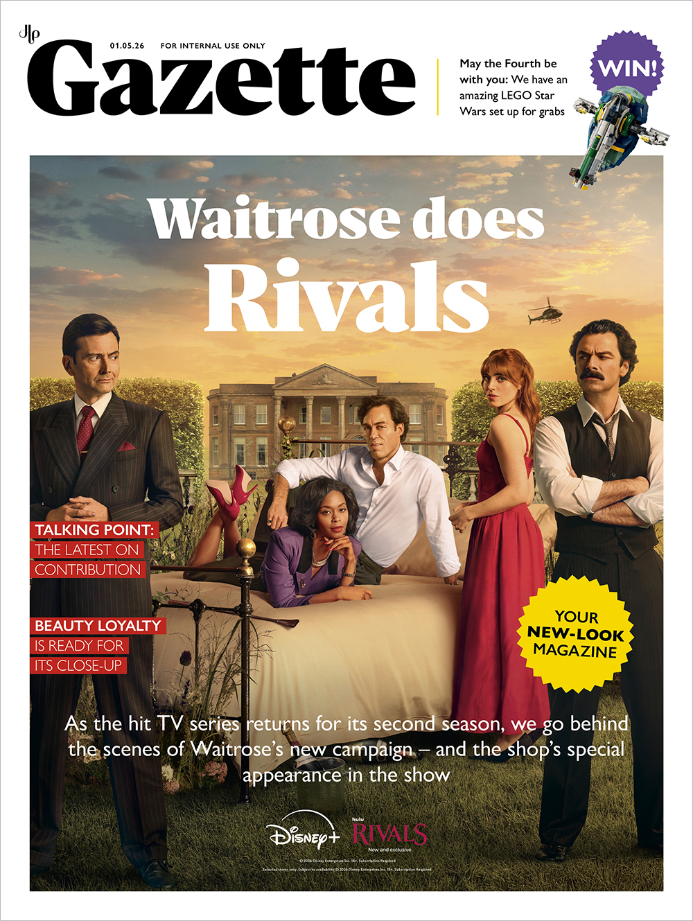
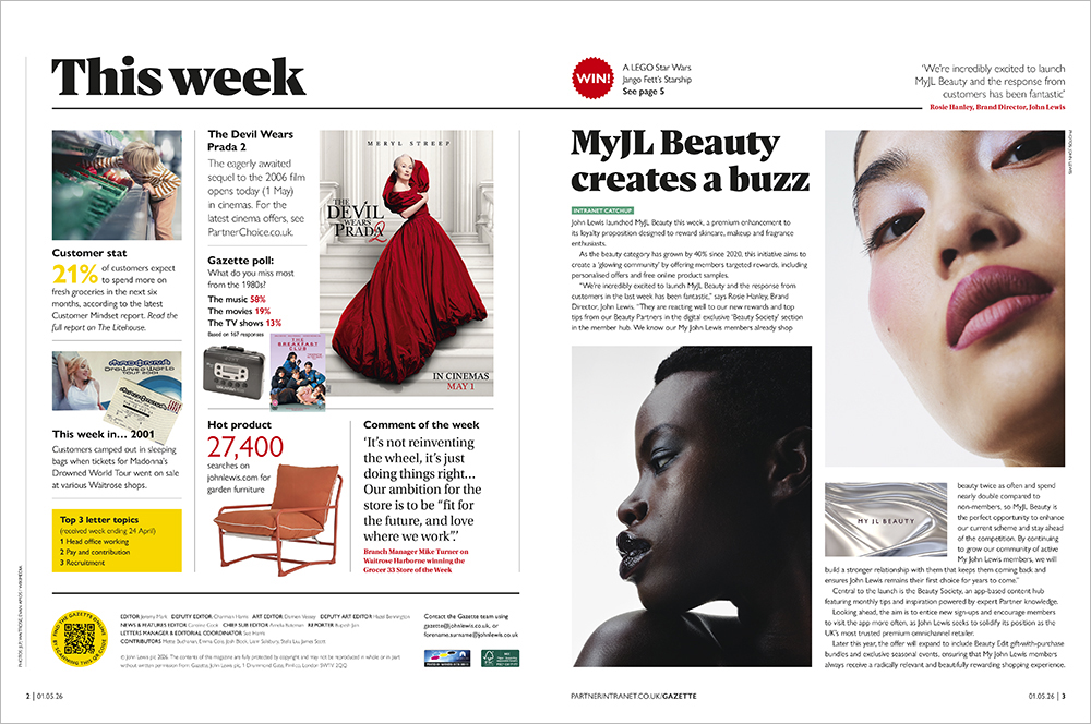
Case study: JLP Gazette redesign
BACKGROUND
The John Lewis Partnership is the UK’s largest employee-owned business. Its weekly Gazette is the UK’s longest-running staff magazine and is a vital tool for engaging Partners (staff) with the business they own, as well as challenging and holding to account the Executive Team and democractic structure.
Over the last few years, due to budget cuts and reduced team numbers, the magazine has reduced in size but not in importance. The magazine is still expected to include a variety of content – news, interviews, Partners letters, Partner opinion, wider retail context, human interest stories, competitions, product launches, events and more.
Against a volatile wider retail environment, the Gazette is needed to impartially report on the state of the Partnership, and inspire Partners to ‘own’ the growth of our business. The magazine does this by having editorial independence and an honest but responsible approach.
The Gazette is aimed at Partners who are time poor and have a wide-ranging understanding of the business. Read everywhere from branch cafés to head office desks, from delivery van cabs to Partners' own homes, the magazine needs to grab attention, have snappy content, look professional and be on brand.
VISION
As Art Director, I felt that the Gazette’s identity had been diluted. A reduced pagination over the last 10 years (since my IoIC Redesign Award win), with specific sections being dropped, had resulted in a magazine that didn’t flow and struggled with trying to include too much content.
I wanted the redesign to focus on four criteria:
• Reinvigorating the magazine’s own visual identity. Our previous redesign was completed when the business wanted the Gazette to match our external customer magazines. Now, the Partnership's individual publications are allowed to have their own distinct character.
• Needing a magazine that can be created by our smaller team, who also have online content to produce, and still hit our weekly deadline.
• Emphasising the Gazette's point of difference – journalism. The magazine is not a series of press releases, it is written by trained Partner reporters, for Partners. This responsibility and editorial independence should be obvious and celebrated.
• Ensuring the structural redesign still enabled easy transfer of content to our retired Partner magazine, Connections. This monthly magazine uses many of the same grids and type hierarchy, and I needed to make sure that design and content compatibility wasn't compromised.
OUTCOME
It's too early to quantify this redesign's success. However, here's some feedback:
• "It looks so good!"
• "Looks fabulous. I particularly love the new masthead and cover design."
• "Love this redesign – a real step forward. Thank you to you and the team for always looking to improve and make a difference."
• "I had a good look through the Gazette last night on the plane home, and it's great – cleaner, and with a great piece on contribution to show the refocus on what's on Partners' minds. Congratulations to you and the team. I can only imagine how hard it is to do something like this. Hope you and the team are deservedly proud."
• "Love the new look Gazette! Kudos to you and the whole team. Please pass on my congratulations and thanks to the rest of the team. I'm looking forward to next week's edition already!"